Accessible Typography: Font Size, Line Height & Readability Standards

Your designer picks a 13px light-gray font because it looks clean. Your developer ships it. Your users with low vision, dyslexia, or cognitive disabilities can’t read your site. Typography is the most visible accessibility layer on any page — it’s literally the thing people are trying to read — and getting it wrong locks out more users than almost any other single issue.
This guide covers the accessible typography requirements that actually matter: font size, line height, letter and word spacing, font choice, text resizing, and the CSS patterns that break when users customize their reading experience. Check any page against these standards instantly with the Typography Accessibility Checker.
Does WCAG specify a minimum font size?
No — and this is the first thing to get right, because the internet is full of confident wrong answers about it.
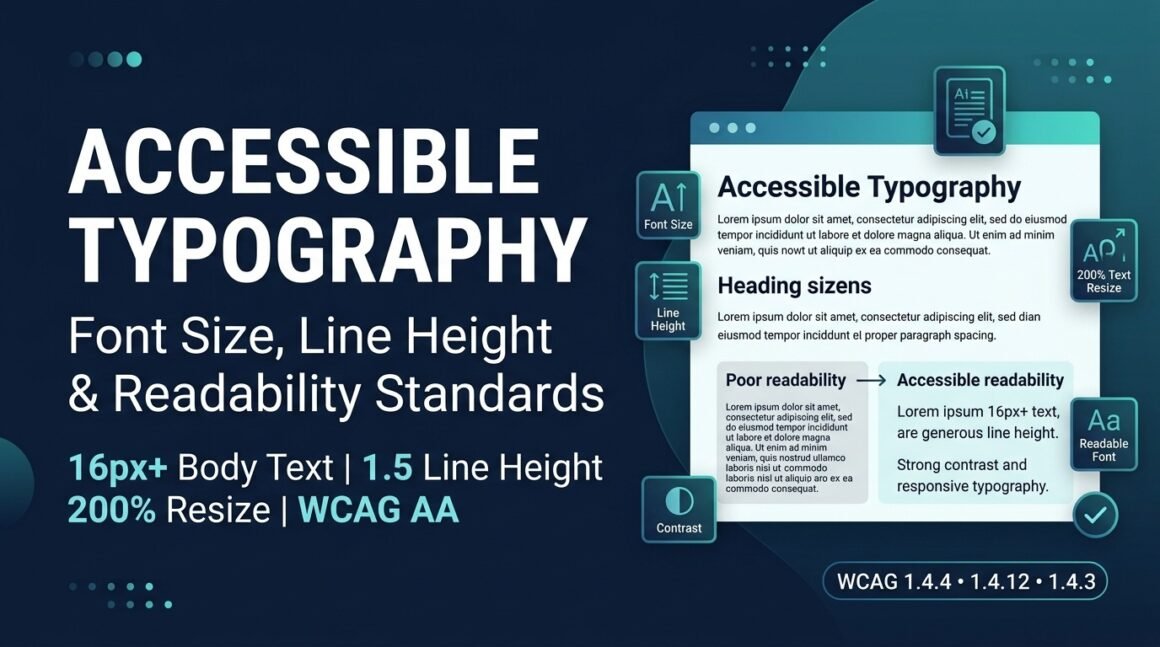
WCAG does not mandate a minimum font size. Not 12px, not 16px, not any number. What WCAG does require is that text can be resized up to 200% without loss of content or functionality (SC 1.4.4, Level AA), and that the page survives when users override your spacing (SC 1.4.12, Level AA). The standard cares about user control, not a specific pixel value.
That said, 16px (1rem) for body text is the practical floor and you should treat it as one. Here’s why:
- Every major browser defaults to 16px.
- Google’s own guidelines use 16px as the readable baseline.
- Material Design specifies 16px body; Apple’s HIG recommends 17px.
- Text below 16px fails readability for many users at typical viewing distances, and below 12px it becomes inaccessible for a significant portion of sighted users.
So the honest answer is: WCAG doesn’t set a number, but the industry, the browsers, and the reading research all converge on 16px. Start there for body text, go larger (18–20px) for audiences that skew older or for content-heavy pages like legal or medical sites, and never go below 12px for any visible text.
The WCAG typography requirements (the actual rules)
Four success criteria govern how text must behave. They don’t tell you which font to pick — they tell you what must survive when users interact with your text.
SC 1.4.4 Resize Text (Level AA)
Text can be resized up to 200% without assistive technology and without loss of content or functionality.
This means users must be able to zoom your page to 200% in the browser and still read everything — no text clipped, no content hidden behind overflow: hidden, no horizontal scrollbar on a single-column layout. The fix is straightforward: use relative units (rem, em, %) instead of fixed px for font sizes, and use flexible layouts that reflow.
/* Bad: fixed pixels ignore user preferences */
body { font-size: 14px; }

/* Good: respects browser default, scales with user settings */
body { font-size: 1rem; } /* = 16px at default, 20px if user sets browser to 20px */
The difference matters: a user who sets their browser default font to 20px gets 20px with 1rem but still gets 14px with a hardcoded 14px. Your relative unit respects their choice; the pixel value overrides it.
SC 1.4.12 Text Spacing (Level AA)
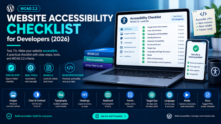
This is the criterion most developers have never heard of and fail constantly. It requires that no content or functionality is lost when a user overrides all four of these properties simultaneously:
| Property | Minimum the page must survive |
|---|---|
| Line height | 1.5× the font size |
| Paragraph spacing | 2× the font size |
| Letter spacing (tracking) | 0.12× the font size |
| Word spacing | 0.16× the font size |
You don’t have to ship these values. The criterion is about what happens when someone else applies them — via a browser extension, a user stylesheet, or an accessibility tool. Your layout must not break. Text must not get clipped, overflow must not hide content, and nothing should overlap.
The patterns that fail most often:
- Fixed-height containers. A card with
height: 200pxclips its text the moment line height increases. Usemin-heightinstead and let the container grow. overflow: hiddenon text containers. Text that expands past the box boundary vanishes. Removeoverflow: hiddenon anything containing text, or switch tooverflow: visible.- Buttons and badges with fixed dimensions. A pill button sized to its text breaks when letter spacing widens. Use padding instead of fixed width/height.
line-heightin pixels.line-height: 24pxcan’t respond to font-size changes. Use a unitless number:line-height: 1.5.
Here’s the CSS test bookmarklet approach — apply all four overrides at once and check nothing breaks:
/* Apply this via browser DevTools or a bookmarklet to test SC 1.4.12 */
* {
  line-height: 1.5 !important;
  letter-spacing: 0.12em !important;
  word-spacing: 0.16em !important;
}
p {
  margin-bottom: 2em !important;
}
Walk every page with this active. Anything that clips, overlaps, or hides content is a failure.
SC 1.4.3 Contrast (Minimum) (Level AA)
Typography and contrast are inseparable — you can pick a perfectly sized, well-spaced font and still make it unreadable with insufficient contrast. The requirements: 4.5:1 for normal text, 3:1 for large text (24px+, or 18.66px+ bold). Full breakdown in the color contrast requirements guide. Check any combination with the Contrast Checker.
SC 1.4.8 Visual Presentation (Level AAA)
AAA isn’t required for legal compliance, but SC 1.4.8 is worth knowing because it codifies best practices: line length no more than 80 characters (about 40em), text not fully justified (no text-align: justify), line height at least 1.5 within paragraphs, paragraph spacing at least 1.5× the line height, and user-controllable foreground/background colors. These are good targets even if you’re only aiming for AA.
Font choice: what actually matters for accessibility
WCAG doesn’t specify which fonts to use, and there’s no official “accessible font” list. But readability research and practical testing point to a few principles:
Sans-serif for screens, generally. Fonts like Inter, Open Sans, Roboto, Arial, and Helvetica test well for screen readability. Serif fonts (Georgia, Charter) also work fine at body sizes — the sans-serif preference is weaker than commonly claimed. What matters more than serif vs. sans-serif is the specific font’s x-height, letter spacing, and character differentiation.
Character differentiation is the real test. Can users distinguish between: I (uppercase I), l (lowercase L), and 1 (the number one)? Between O (uppercase O) and 0 (zero)? Fonts with ambiguous letterforms fail this. Test your chosen font with the string Il1 O0 — if any pair looks identical, choose a different font or a different weight.
Avoid decorative or condensed fonts for body text. Script fonts, all-caps display faces, and ultra-condensed weights reduce readability for everyone and create real barriers for users with dyslexia or low vision. Reserve them for short headings if at all.
Offer user control where possible. Some sites let users switch between a default and a dyslexia-friendly font (like OpenDyslexic or Atkinson Hyperlegible). This isn’t a WCAG requirement, but it’s a genuine accommodation that costs almost nothing to implement.
The typography CSS patterns that break accessibility
These are the specific code patterns that cause failures, pulled from real audits.
Fixed font sizes in pixels
/* Breaks SC 1.4.4: ignores user font-size preferences */
body { font-size: 14px; }
h1 { font-size: 32px; }

/* Accessible: scales with user settings */
body { font-size: 1rem; }
h1 { font-size: 2rem; }
line-height in fixed units
/* Breaks SC 1.4.12: can't adapt when user increases font size */
p { line-height: 20px; }

/* Accessible: scales proportionally */
p { line-height: 1.5; }  /* unitless = 1.5 × computed font-size */
Fixed-height text containers
/* Breaks SC 1.4.12: clips text when spacing increases */
.card-body {
  height: 120px;
  overflow: hidden;
}

/* Accessible: grows with content */
.card-body {
  min-height: 120px;
  overflow: visible;
}
text-align: justify without hyphenation
/* Creates uneven word spacing, especially harmful for dyslexia */
p { text-align: justify; }

/* Accessible: left-aligned (or justified with hyphenation) */
p { text-align: left; }

/* If you must justify: */
p {
  text-align: justify;
  hyphens: auto;
  -webkit-hyphens: auto;
}
Justified text without hyphenation creates “rivers” of white space — irregular gaps that run vertically through paragraphs. For readers with dyslexia, these rivers cause words to jump and lines to blur together. Left-aligned text produces a ragged right edge, which is consistently easier to track line by line.
Viewport-only font sizing without clamp
/* Dangerous: text becomes illegibly small on mobile */
h1 { font-size: 5vw; }

/* Safe: clamped to readable min and max */
h1 { font-size: clamp(1.5rem, 4vw, 3rem); }
clamp() lets the font scale fluidly with the viewport while guaranteeing it never drops below a readable minimum or bloats beyond a sensible maximum.
A practical typography checklist
Before you ship, walk through these:
- Body text is at least 16px (1rem) at default browser settings.
- All font sizes use relative units (
rem,em,%), not fixedpx. - Page remains usable at 200% browser zoom — no clipped text, no horizontal scroll on single-column layouts.
- Page survives the SC 1.4.12 text-spacing override test — no overlaps, no hidden content.
- Line height is at least 1.5 for body text, using a unitless value.
- No fixed-height containers on text-bearing elements.
- No
overflow: hiddenon text containers. - Text contrast meets 4.5:1 (normal) or 3:1 (large) per SC 1.4.3.
- Line length stays under ~80 characters for comfortable reading.
- Font has clear character differentiation (
Il1,O0). - No
text-align: justifywithouthyphens: auto. I l1 O0test passes on the chosen font at body size.
Run the page through the Typography Accessibility Checker to catch the automated side of this, then pair it with a full scan for contrast and the rest.
Accessible Typography FAQ
What is the minimum font size for WCAG compliance?
WCAG doesn’t specify one. The practical standard is 16px (1rem) for body text, and nothing below 12px for any visible text. What WCAG requires is that text can be resized to 200% without breaking (SC 1.4.4).
What line height should I use?
1.5 for body text is both the WCAG 1.4.12 survival threshold and the widely recommended default. Use a unitless value (line-height: 1.5), not pixels.
Does WCAG require a specific font?
No. WCAG doesn’t mandate any typeface. Choose fonts with good character differentiation, adequate x-height, and clear letterforms. Sans-serif fonts generally test well on screens.
What does SC 1.4.12 actually require?
It requires that your page doesn’t break when a user overrides line height to 1.5×, paragraph spacing to 2×, letter spacing to 0.12×, and word spacing to 0.16× the font size. You don’t have to ship those values — your layout just has to survive them.
Should I use px or rem for font sizes?
rem (or em). Pixel values override user browser settings; relative units respect them. This is the single most impactful typography accessibility fix.
Is justified text an accessibility issue?
It can be. Without hyphenation, justified text creates uneven word spacing (“rivers”) that impair readability, especially for users with dyslexia. Left-aligned text is safer.
Check your typography now
Typography issues hide in plain sight — the page “looks fine” on your 27-inch monitor and fails on someone else’s screen or with their spacing overrides active. Run your pages through the Typography Accessibility Checker to catch font-size, line-height, and spacing issues, then pair it with the Contrast Checker for the color side and a full scan for everything else. Free, no account.
This article is general guidance, not legal advice. Typography is one layer of a broader accessibility practice — pair automated checks with real-user testing before making compliance claims.