WCAG Color Contrast Requirements: 4.5:1 vs 3:1 Explained (2026)

Your brand’s light gray text looks clean in Figma. It ships. Three weeks later an automated scan flags dozens of “contrast” failures across the site, and nobody’s sure which ones are real or how to fix them without repainting the whole brand.
This guide explains the WCAG color contrast requirements in plain terms: what the 4.5:1 and 3:1 ratios actually mean, when each one applies, what’s exempt, and the specific mistakes that trip up developers. By the end you’ll be able to look at any text or UI element and know the exact threshold it has to hit.
What a contrast ratio actually is
Contrast ratio is a single number describing how different two colors are in luminance (perceived brightness). It runs on a scale from 1:1 to 21:1:
- 1:1 — the two colors are identical. White on white. Invisible.
- 21:1 — the maximum possible. Pure black (
#000000) on pure white (#FFFFFF).
Everything you design lands somewhere between those two extremes. WCAG sets minimum ratios your combinations must clear. The ratio is calculated from the relative luminance of each color:
contrast ratio = (L1 + 0.05) / (L2 + 0.05)
…where L1 is the luminance of the lighter color and L2 the darker. Luminance itself is derived from the sRGB red, green, and blue channels, gamma-corrected and weighted for how the human eye perceives each (green contributes far more than blue). You almost never compute this by hand — a Contrast Checker does it instantly — but it’s worth knowing the number is about perceived brightness difference, not hue. Two colors can look wildly different (red vs. green) and still fail contrast, because they’re similar in luminance.
The core requirement: 4.5:1 vs 3:1 (SC 1.4.3, Level AA)
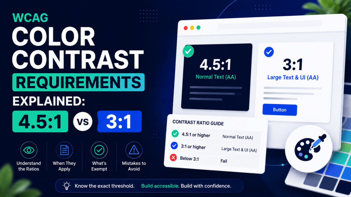
This is the one the title promises and the one you’ll cite most. Success Criterion 1.4.3 Contrast (Minimum), Level AA, sets two thresholds for text:
- 4.5:1 for normal text.
- 3:1 for large text.
That’s the whole rule — but the catch is in the definition of “large.”
What counts as “large text”
Larger text is easier to read at lower contrast, so WCAG relaxes the requirement for it. Text qualifies as “large” when it’s:
- 18pt (24px) or bigger at normal weight, or
- 14pt (18.66px) or bigger at bold weight.
| Text | Weight | Threshold |
|---|---|---|
| Below 24px | Normal | 4.5:1 |
| 24px and up | Normal | 3:1 |
| Below 18.66px | Bold | 4.5:1 |
| 18.66px and up | Bold | 3:1 |
The mistake developers make here is assuming their headings are “large” without checking the actual computed size. A 20px non-bold subheading is not large text — it still needs 4.5:1. Bold buys you a lower threshold, but only from 18.66px up.
A concrete anchor
On a white background, #767676 gray gives about 4.54:1 — it’s roughly the lightest gray that still passes for normal text. Go any lighter (say #949494, around 2.8:1) and normal text fails. Keep that anchor in your head: if your body text is lighter than mid-gray on white, it’s probably failing.
The other 3:1: non-text contrast (SC 1.4.11, Level AA)
Here’s the requirement most teams miss entirely. SC 1.4.11 Non-text Contrast (added in WCAG 2.1), Level AA, requires 3:1 contrast for:
- UI component boundaries that you need to see to operate — the border of a text input, the edge of a checkbox, a button’s outline against its background.
- Graphical objects needed to understand content — the bars in a chart, the slices of a pie graph, icons that convey meaning.
- Focus indicators — the ring or outline showing which element is keyboard-focused.
This is why a pale form field with a #E0E0E0 border on white fails: the user literally cannot see where the input is. Same for a faint focus outline, or a bar chart in five barely-distinguishable pastels. Text contrast passes, but the interface doesn’t. If you only ever check text, you’ll ship a site that fails 1.4.11 all over the place.
The AAA tier: enhanced contrast (SC 1.4.6)
SC 1.4.6 Contrast (Enhanced), Level AAA, raises the bar:
- 7:1 for normal text.
- 4.5:1 for large text.
Most sites target Level AA, which is what the law references — so you don’t have to hit AAA. But it’s worth knowing #595959 on white lands around 7:1, a useful target when you want text that’s comfortable for low-vision users, not just technically compliant. Body text at AAA is genuinely easier to read for everyone.
The complete threshold reference
| What you’re checking | Success Criterion | Level | Minimum ratio |
|---|---|---|---|
| Normal text (below 24px / 18.66px bold) | 1.4.3 | AA | 4.5:1 |
| Large text (24px+, or 18.66px+ bold) | 1.4.3 | AA | 3:1 |
| UI components, borders, focus, graphics | 1.4.11 | AA | 3:1 |
| Normal text (enhanced) | 1.4.6 | AAA | 7:1 |
| Large text (enhanced) | 1.4.6 | AAA | 4.5:1 |
Bookmark this table. Ninety percent of contrast questions are answered by finding the right row.
What’s exempt (so you don’t over-fix)
Not everything on the page has to pass. WCAG explicitly exempts:
- Logos and brand names. A logo’s colors have no contrast requirement. Your wordmark can be whatever it is.
- Incidental text. Text that’s decorative, not visible to anyone, or part of an inactive/disabled UI component. A grayed-out disabled button is allowed to be low-contrast — because it’s communicating “you can’t use this.”
- Pure decoration. Text in a photo of a street sign, for example, where the text isn’t the content you’re conveying.
The disabled-control exemption trips people up in both directions. Disabled buttons are exempt — but if a control looks disabled and low-contrast yet is actually operable, that’s a real failure. Match the appearance to the behavior.
The failures developers actually hit
In practice, contrast bugs cluster around a handful of patterns:
- Placeholder text. The default browser placeholder gray is often around 2.8–3:1 — below the 4.5:1 needed if you’re treating it as readable content. Don’t use placeholders as labels.
- Light-gray body text. The
#999“subtle” paragraph. Looks elegant, fails AA. - White text on light brand colors. White on a mid-tone brand blue or green frequently lands in the 3–4:1 range — fine for large headings, failing for body or small buttons.
- Low-contrast focus rings. A faint focus outline fails 1.4.11 and breaks keyboard usability at the same time.
- Text over images/gradients. Contrast varies pixel by pixel across the image. Add a scrim or solid backing behind the text.
- Hover and state colors. The default passes, but the
:hoveror:visitedcolor nobody re-checked doesn’t. - Chart and data-viz colors. Adjacent series that are distinct in hue but nearly equal in luminance — fails 1.4.11 and is invisible to many color-blind users too.
How to check contrast (and fix it without wrecking your brand)
Checking is the easy part. Drop your foreground and background hex values into the Contrast Checker and it returns the ratio plus a pass/fail against each threshold. Run a full page scan to catch every failing combination at once with the exact selectors.
Fixing without a brand overhaul comes down to a few moves:
- Adjust lightness, not hue. Work in HSL and drop the L value of your text (or raise the background’s) until it passes. Your brand hue stays intact; only the brightness shifts. Often a 10–15% lightness change is all it takes.
- Darken text before you lighten backgrounds. Text is usually the smaller area — nudging it darker is less visually disruptive than repainting large surfaces.
- Reserve low-contrast brand color for large display type. If your brand teal only hits 3.2:1, use it for big headings (where 3:1 is the bar) and switch to a darker variant for body copy.
- Never rely on opacity for “subtle” text.
opacity: 0.5gray on a busy background produces unpredictable contrast. Use a solid, tested color value instead. - Give focus indicators real contrast. A 2px outline at 3:1+ against both the component and the page background — don’t let it be a whisper.
While you’re in the color system, pair contrast work with the Colour Blindness Simulator and the Typography Accessibility Checker — contrast, color independence, and legible type are the three legs of readable text, and they’re cheapest to fix together.
What about APCA and WCAG 3?
You may have seen APCA (the Advanced Perceptual Contrast Algorithm) described as the “new” contrast method. Here’s the honest 2026 status: APCA is a promising, research-backed perceptual model developed as part of the WCAG 3 effort — but the visual-contrast section was moved out of the WCAG 3 Working Draft in July 2023 for further evaluation, and the current draft states the WCAG 3 contrast algorithm is still to be determined. APCA is a candidate, not an adopted standard, and it isn’t in the active draft right now.
WCAG 3 itself remains a Working Draft, with a final Recommendation not realistically expected before the late 2020s. Meanwhile every law and procurement standard that matters — the DOJ’s ADA rules, the European Accessibility Act, Section 508 — references WCAG 2.x Level AA. So:
- Your compliance floor is WCAG 2: the 4.5:1 and 3:1 ratios in this guide. That’s what you must meet today.
- If you’re doing a design-system refresh, you can use APCA as an extra readability lens — but only on colors that also pass WCAG 2. Don’t ship a palette that fails 4.5:1 because APCA says it’s fine; that’s the combination that draws automated-scanner lawsuits.
Build to WCAG 2 now. Treat APCA as interesting, not binding.
Color Contrast FAQ
Is it 4.5:1 or 3:1 — which do I use?
4.5:1 for normal text, 3:1 for large text (24px+, or 18.66px+ bold) and for UI components/graphics. When in doubt, hit 4.5:1 and you’re covered everywhere.
Does contrast apply to disabled buttons?
No. Inactive/disabled controls are exempt. But make sure anything that’s actually operable meets the threshold.
What contrast do focus indicators need?
3:1 against adjacent colors, under SC 1.4.11. A visible focus ring is also required by SC 2.4.7.
Do I need AAA (7:1)?
Not for legal compliance — AA is the referenced standard. AAA is a good target for body-heavy, low-vision-sensitive content.
Did WCAG 2.2 change the contrast numbers?
No. The contrast criteria come from WCAG 2.0 (1.4.3, 1.4.6) and 2.1 (1.4.11). WCAG 2.2 added other criteria but left contrast thresholds unchanged.
Can I use APCA instead of the 4.5:1 rule?
Not for compliance. APCA isn’t in the current WCAG 3 draft and no law references it. Use WCAG 2 as the requirement; APCA is optional readability guidance on top.