Designing for Color Blindness: A Developer’s Guide to Color-Accessible UI

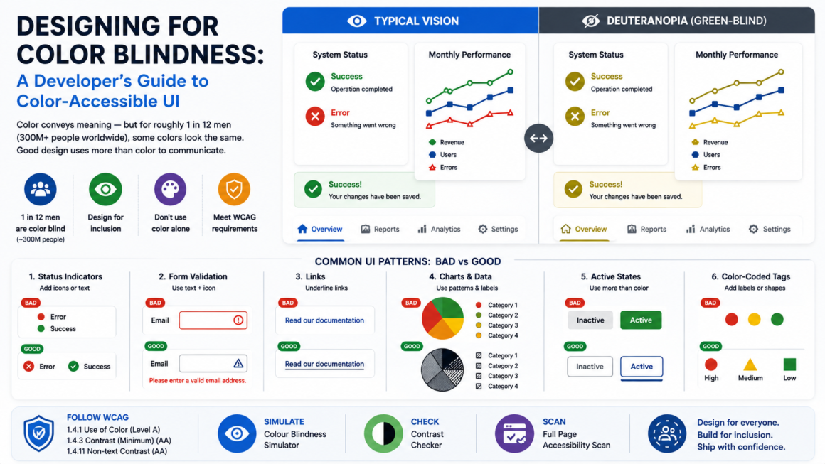
You pick a clean red-and-green status system — red for errors, green for success — ship it, and assume the job is done. For roughly 1 in 12 men using your product, those two states are nearly identical. Red-green color blindness alone affects about 8% of men and 0.5% of women worldwide — an estimated 300 million people. That’s not a fringe edge case. That’s a user segment larger than the population of the United States.
This guide covers how to design for color blindness in practice: the types of color vision deficiency that matter for UI, the WCAG requirements, the specific patterns that fail, and the fixes — with real code examples. Preview any of these before you ship using the Colour Blindness Simulator.
The types of color blindness that affect your UI
Color blindness isn’t one condition — it’s a spectrum of how the cone cells in the retina respond to light. Practically, three categories cover what you’ll encounter in design work.
Red-green deficiency (the big one)
This covers about 98% of all color blindness cases. There are four subtypes, but they all share the same design implication: reds, greens, oranges, and some browns become hard or impossible to distinguish from each other.
- Deuteranomaly — reduced green sensitivity. The most common single type, affecting roughly 2.3% of the population. Greens shift toward red/brown.
- Protanomaly — reduced red sensitivity (about 0.5%). Reds appear muted and shift toward green/brown. Reds also appear darker than normal — this is unique to protan deficiency and matters for contrast.
- Deuteranopia — green cones missing entirely (about 0.6%). More severe than deuteranomaly.
- Protanopia — red cones missing entirely (about 0.5%). More severe than protanomaly, with the same darkening effect on reds.
Blue-yellow deficiency (rare but real)
- Tritanomaly / Tritanopia — reduced or absent blue cone function. Affects fewer than 0.01% of people. Blues and yellows become confused; blue can appear greenish, yellow can appear pinkish. Unlike red-green deficiency, this isn’t sex-linked — it affects men and women equally.
Total color blindness
- Achromatopsia — complete absence of color vision, seeing only shades of gray. Extremely rare (roughly 1 in 33,000). Often accompanied by light sensitivity and reduced visual acuity. Outside of isolated island populations with founder effects, you’re unlikely to encounter this at scale — but your design should still work in grayscale as a baseline test.
The practical takeaway for designers: red-green is the one you must design around. It’s overwhelmingly the most common, and it’s the one most UIs accidentally exclude. If your design survives a deuteranopia simulation, it’ll work for the vast majority of color-blind users.
What WCAG actually requires
Two success criteria govern color accessibility. They’re separate requirements, and meeting one doesn’t satisfy the other.
SC 1.4.1 Use of Color (Level A)
“Color is not used as the only visual means of conveying information, indicating an action, prompting a response, or distinguishing a visual element.”
This is the core rule. It’s Level A — the absolute floor. It doesn’t ban color. It says color cannot be the sole carrier of meaning. Every piece of information conveyed by color must also be conveyed by something else: text, shape, pattern, position, or an icon.
SC 1.4.3 Contrast (Minimum) (Level AA)
This is the color contrast requirement — 4.5:1 for normal text, 3:1 for large text. It applies to everyone, not just color-blind users, but it intersects with color blindness because protan deficiency causes reds to appear darker. A red that passes 4.5:1 for typical vision might effectively fail for someone with protanopia, because the perceived luminance drops. Test your reds with the Contrast Checker and the Colour Blindness Simulator together.
SC 1.4.11 Non-text Contrast (Level AA)
UI components and graphical objects need 3:1 against adjacent colors. For color-blind users, this means chart segments, icon fills, and status indicators that look distinct to typical vision might fall below 3:1 under simulated color blindness — even if the original colors clear the threshold.
The patterns that fail (and how to fix each one)
These are the specific UI patterns that break for color-blind users, sorted by how often they show up in real audits.
1. Red/green status indicators with no secondary cue
The most common failure on the web. Error = red, success = green, and nothing else distinguishes them.
The fix — add shape, icon, or text:
<!-- Bad: color is the only differentiator -->
<span class="status-success" style="color: green;">Active</span>
<span class="status-error" style="color: red;">Failed</span>

<!-- Good: icon + text + color -->
<span class="status-success">
  <svg aria-hidden="true"><!-- checkmark icon --></svg>
  Active
</span>
<span class="status-error">
  <svg aria-hidden="true"><!-- X icon --></svg>
  Failed
</span>
The icons do the heavy lifting. Color becomes reinforcement, not the message. Screen readers get the text; color-blind users get the shape; everyone benefits.
2. Form validation by color alone
Required fields marked only with a red border. Error messages styled only in red with no icon or label change. The field “turns red” but nothing else happens.
The fix — combine color with text and iconography:
<!-- Bad: only the border color changes -->
<input style="border-color: red;" />

<!-- Good: icon, text, aria, and color together -->
<div class="field-group field-error">
  <label for="email">
    Email <span class="required">(required)</span>
  </label>
  <input id="email" aria-describedby="email-error" aria-invalid="true" />
  <p id="email-error" class="error-message">
    <svg aria-hidden="true"><!-- warning icon --></svg>
    Please enter a valid email address.
  </p>
</div>
The error is now communicated four ways: color, icon, text, and ARIA. Any one of them alone is sufficient — together they’re bulletproof.
3. Links distinguished from body text by color only
WCAG 1.4.1 specifically calls this out. If your links are the same font, same weight, same size as surrounding text, and only the color is different, a color-blind user may not see them as links at all.
The fix — underline links in body text:
/* Body text links: underline by default */
article a {
  text-decoration: underline;
  text-decoration-thickness: 1px;
  text-underline-offset: 2px;
}

/* Navigation links don't need underlines —
   their position already signals interactivity */
nav a {
  text-decoration: none;
}
The underline is the oldest, most reliable secondary cue for links. If you remove it for aesthetic reasons, you need something else — a border-bottom, a background highlight, font-weight change, or an icon — to make links identifiable without color.
4. Charts and data visualization
This is where color blindness causes the most information loss. A line chart with six color-coded series, a pie chart with adjacent red and green slices, a heat map in red-to-green — all of these can become unreadable.
The fix — combine color with pattern, shape, and direct labels:
- Use different dash patterns for lines (solid, dashed, dotted).
- Use different marker shapes for data points (circle, square, triangle, diamond).
- Label series directly on the chart rather than relying on a color-keyed legend.
- Choose a colorblind-safe palette — there are well-tested options (Wong, Okabe-Ito, IBM Design, Tableau’s colorblind palette) that maintain distinguishability across all common deficiency types.
- For heat maps, use a single-hue sequential ramp (light-to-dark blue) instead of a diverging red-to-green. The luminance gradient survives any color deficiency.
5. Color-coded categories (tags, badges, labels)
“Priority: High” in red, “Priority: Low” in green, with no other differentiator. Or a Kanban board where card category is conveyed entirely by a colored left border.
The fix — add text labels or patterns:
<!-- Bad: color-only category -->
<span class="tag" style="background: #e74c3c;"></span>

<!-- Good: text + color -->
<span class="tag tag-high">
  High
</span>
If you need the color dot as a compact visual, keep it — but pair it with a text label, or at minimum use shapes (circle for high, triangle for medium, square for low) so the signal survives without color.
6. Toggle/active states by color change only
A tab that “turns blue” when active, a button that “turns green” when toggled on. If the color change is the only visual shift, it’s invisible to some users.
The fix — combine color with weight, position, border, or icon:
/* Active tab: color + bottom border + font weight */
.tab.active {
  color: var(--brand-blue);
  border-bottom: 3px solid var(--brand-blue);
  font-weight: 700;
}

/* Inactive tab */
.tab {
  color: var(--text-secondary);
  border-bottom: 3px solid transparent;
  font-weight: 400;
}
The border and weight change are perceptible regardless of color vision.
Building a colorblind-safe palette
You don’t have to abandon color — you have to choose colors that remain distinguishable under the most common deficiency types. A few principles:
Vary luminance, not just hue. Two colors can look wildly different in hue (red vs. green) but nearly identical in brightness — that’s exactly the combination that fails. If you desaturate your palette to grayscale and the colors are still distinct, you’re in good shape.
Use the Okabe-Ito or Wong palettes as a starting point. These are research-tested sets of 8 colors specifically designed to be distinguishable across all common types of color vision deficiency. They’re free, published, and widely adopted in scientific visualization. Adapt them to your brand rather than inventing from scratch.
Test with simulation, not assumption. Run your palette through the Colour Blindness Simulator under deuteranopia, protanopia, and tritanopia. If adjacent elements merge under any simulation, either increase the luminance difference or add a non-color cue.
Avoid these specific pairings — they’re the highest-failure combinations for red-green deficiency:
- Red and green (the obvious one)
- Red and brown
- Green and brown
- Green and orange
- Blue and purple (fails for some tritanopia cases)
Don’t rely on “colorblind-friendly” alone. Even a perfect palette still needs secondary cues for the patterns above (status indicators, charts, links, form validation). Palette choice reduces the problem; redundant encoding eliminates it.
How to test for color blindness issues
Three layers, from fastest to most thorough:
1. The grayscale test. Convert your screen or a screenshot to grayscale. If you can still distinguish every meaningful element — status indicators, chart series, links from text, active from inactive states — your design survives the most extreme case. This takes ten seconds and catches the worst problems.
2. Simulation tools. Run your pages through the Colour Blindness Simulator to see them as they appear under deuteranopia, protanopia, and tritanopia. Browser DevTools also have a rendering panel with vision simulation — Chrome’s “Emulate vision deficiencies” is built in and free.
3. The WCAG audit. Check SC 1.4.1 (use of color) specifically — go element by element and ask: “If I remove all color from this, does the information survive?” If the answer is no for any element, add a secondary cue. Pair this with a full page scan for the contrast side (SC 1.4.3 and 1.4.11).
If you’re recording these findings in a VPAT, SC 1.4.1 is one of the first rows in the WCAG Level A table — and “Partially Supports” with a blank remark is the fastest way to get it bounced back.
Color Blindness Design FAQ
How many users are actually color blind?
About 8% of men and 0.5% of women — roughly 300 million people worldwide. Red-green deficiency accounts for about 98% of cases.
Does WCAG ban the use of red and green?
No. WCAG bans using color as the only means of conveying information. You can use red and green freely — just pair them with a secondary cue (icon, text, pattern, shape) so the meaning doesn’t depend on distinguishing the colors.
Is a colorblind-safe palette enough?
It reduces the risk significantly, but it’s not sufficient on its own. SC 1.4.1 requires redundant encoding — meaning information must be available through a non-color channel regardless of how distinguishable your palette is.
Do I need to test every type of color blindness?
Test deuteranopia (green-blind) and protanopia (red-blind) at minimum — they cover the vast majority of cases. Tritanopia (blue-yellow) is worth a check if your design leans heavily on blue/yellow contrast. The grayscale test catches everything at once as a baseline.
What about dark mode?
Dark mode changes the contrast context but not the color-blindness problem. Test your dark-mode palette the same way — simulation + grayscale + SC 1.4.1 check. Colors that are distinct on a light background may merge on a dark one, and vice versa.
Does this apply to mobile apps too?
Yes. WCAG and color-blindness testing apply to any visual interface — web, iOS, Android, desktop. The same patterns fail on all of them.
Simulate before you ship
Every pattern in this guide comes down to one question: does the information survive without color? Run your pages through the Colour Blindness Simulator to see exactly what your color-blind users see — then pair it with the Contrast Checker for the 4.5:1 and 3:1 thresholds and a full scan to catch everything else. Free, no account.