WCAG 2.2 Target Size: The New Click Target Requirements Explained
 By Admin
9 min read
By Admin
9 min read 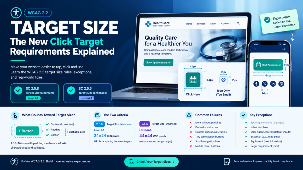
A 16×16 pixel icon button on a dense toolbar. A tiny checkbox crammed next to a wall of text. A row of social icons packed 4 pixels apart. They work fine for your mouse pointer, and they’re a nightmare for anyone with a tremor, limited dexterity, or a fingertip on a phone screen.
WCAG 2.2 introduced target size as a Level AA requirement for the first time. Before 2.2, target size lived only at Level AAA (the aspirational tier most sites don’t target). Now it’s in the same tier as color contrast and keyboard access, the tier the law references. This guide explains the two target-size criteria, what counts toward the size, the exceptions that trip people up, and the CSS patterns to fix the most common failures. Check your pages against the full WCAG 2.2 criteria with the WCAG 2.2 Checklist.
The Two Target Size Criteria
WCAG 2.2 has two target-size success criteria. They’re related but different and the numbering is confusing because the AAA one has a lower number (it was published first in WCAG 2.1).
SC 2.5.8 Target Size (Minimum): Level AA
Interactive targets must be at least 24×24 CSS pixels, OR have at least 24px of spacing from any adjacent target.
This is the new one added in WCAG 2.2 (October 2023), Level AA, and the one that matters for compliance. It’s what the ADA Title II rule, the HHS Section 504 rule, and the EAA all reference (through WCAG 2.1 AA, with 2.2 increasingly adopted).
SC 2.5.5 Target Size (Enhanced): Level AAA
Interactive targets must be at least 44×44 CSS pixels.
This is the stricter, older criterion from WCAG 2.1. Level AAA means it’s not legally required, but it’s the better design target. Apple’s Human Interface Guidelines recommend 44×44 points, Google’s Material Design recommends 48×48dp — both align with AAA, not AA. The AA minimum of 24×24 is a compliance floor, not a usability target.
The practical rule: build to 44×44 (AAA), test against 24×24 (AA). That way you pass compliance easily and your users can actually hit the targets.
What Counts as “Target Size”
This is where most confusion lives. The target isn’t just the visible icon or text; it’s the entire clickable/tappable area, including padding.
A 16×16 pixel icon with 14px of padding on all sides has a clickable area of 44×44 pixels it passes AAA, even though the visible icon is tiny. This is the key insight: padding counts. You don’t have to make every icon visually huge; you have to make the hit area large enough.
/* The icon is 16×16, but the clickable target is 44×44 */
.icon-button {
  display: inline-flex;
  align-items: center;
  justify-content: center;
  width: 16px;
  height: 16px;
  padding: 14px;  /* 16 + 14 + 14 = 44px total */
  cursor: pointer;
}
What’s measured is the CSS pixel size of the element that receives the pointer event: the element with the click handler, the <a>, the <button>, or the <input>. If that element is 44×44 (including padding, border, and content), it passes, regardless of what the visual content inside it looks like.
The SC 2.5.8 Exceptions (and the Spacing Alternative)
SC 2.5.8 has six exceptions. Understanding them prevents over-remediation:
1. Spacing alternative
A target smaller than 24×24 still passes if there’s at least 24px of clear space between it and every adjacent target. The idea: if you can’t make the target big enough, at least make sure a miss doesn’t hit something else.
This is measured as the distance from the edge of one target to the nearest edge of the next target: the “target offset.” If a 20×20 icon button has 24px of empty space between it and the next clickable element, it passes even at 20×20.
2. Inline
Targets within a sentence or block of text are exempt. This is the big one for web content: links inside paragraphs don’t need to be 24×24. The rationale: inline links are constrained by line height, and requiring 24px tall hit areas inside a 20px line would break every paragraph on the web. However, adequate line height (1.5 or more) helps make inline links more tappable even without the size requirement.
3. User agent control
Targets whose size is determined by the browser’s default rendering (not your CSS) are exempt. Default checkboxes, radio buttons, and select dropdowns in their unstyled state fall here. The moment you style them with custom CSS, you’ve taken control and the exemption no longer applies.
4. Essential
A specific presentation of the target is essential to the information being conveyed. This is narrow; it covers things like a pin on an interactive map or a node in a diagram where the position itself is the information. “Essential” doesn’t mean “convenient” or “matches our design.”
5. Equivalent
A conforming alternative target for the same function exists elsewhere on the page. A tiny icon has a full-sized text link next to it that does the same thing; the icon is exempt because the text link passes.
6. Legal requirement
The size is determined by law (e.g., a legally mandated button dimension). Extremely rare in practice.
The Patterns That Fail (and How to Fix Each One)
These are the specific UI patterns that violate target size most often, pulled from real audits.
Icon-only buttons without padding
The visible icon is the entire clickable area: 16×16, 20×20, or similar.
/* ❌ Failing: clickable area is only 16×16 */
.close-btn {
  width: 16px;
  height: 16px;
  background: url('close.svg');
  cursor: pointer;
}

/* ✅ Passing: padding expands clickable area to 44×44 */
.close-btn {
  width: 16px;
  height: 16px;
  padding: 14px;
  background: url('close.svg') center no-repeat;
  cursor: pointer;
}
Packed icon rows (social links, toolbars)
A row of social icons at 24×24 with 4px gaps. Each icon passes the AA size, but the gap is so small that a missed tap lands on the wrong icon, defeating the purpose.
/* ❌ Failing: icons pass size but gaps cause mis-taps */
.social-icons a {
  display: inline-block;
  width: 24px;
  height: 24px;
  margin-right: 4px;
}

/* ✅ Passing: larger hit area + adequate spacing */
.social-icons a {
  display: inline-flex;
  align-items: center;
  justify-content: center;
  min-width: 44px;
  min-height: 44px;
  margin-right: 8px;
}
Custom checkboxes and radio buttons
Developers hide the native input and style a replacement, but the replacement is often 16×16 or 18×18 with no padding expansion. Once you’ve replaced the browser’s default rendering, the user-agent exception no longer applies.
/* ❌ Failing: custom checkbox is 18×18 */
.custom-checkbox {
  width: 18px;
  height: 18px;
}

/* ✅ Passing: visual is 18×18, clickable area is 44×44 */
.custom-checkbox {
  width: 18px;
  height: 18px;
  padding: 13px;
}

/* Alternative: wrap in a label with padding */
label.checkbox-wrapper {
  display: inline-flex;
  align-items: center;
  padding: 13px;
  cursor: pointer;
  gap: 8px;
}
Table action buttons
Edit/delete icon buttons crammed into the last column of a data table, each 20×20 with 2px spacing.
/* ✅ Fix: ensure minimum size even in compact tables */
.table-actions button {
  min-width: 44px;
  min-height: 44px;
  padding: 12px;
}
If 44×44 buttons don’t fit your table layout, ensure at least 24px spacing between them (the SC 2.5.8 spacing alternative).
Breadcrumb and pagination links
Small text links in breadcrumbs and pagination strips often measure 12–16px tall with tight spacing. They’re technically “inline” if they’re inside a block of text but breadcrumbs and pagination are navigation, not prose. They don’t get the inline exception.
/* ✅ Fix: make pagination links proper touch targets */
.pagination a,
.breadcrumb a {
  display: inline-block;
  min-height: 44px;
  line-height: 44px;
  padding: 0 12px;
}
Mobile nav and hamburger menus
The hamburger icon is 24×24 but the tappable area is only 30×30 passes AA but is frustrating on mobile. Apple and Google both recommend 44+ points / 48+ dp for a reason.
/* ✅ Mobile-friendly: generous tap area */
.hamburger-btn {
  display: flex;
  align-items: center;
  justify-content: center;
  min-width: 48px;
  min-height: 48px;
  padding: 12px;
}
How to Test Target Size
Automated testing
As of 2026, automated testing for SC 2.5.8 is still limited. Most WCAG scanners (including axe, Lighthouse, and WAVE) do not reliably test target size; the criterion requires layout-aware measurement of computed element sizes and gaps, which is technically complex for automated tools. Run a full scan to catch other issues, but expect to verify target size manually.
Manual testing the DevTools method
- Open Chrome DevTools → Elements panel.
- Select the target element.
- Look at the Box Model visualization; it shows content, padding, border, and margin. The clickable area is content + padding + border.
- Verify the total is at least 24×24 (AA) or 44×44 (AAA).
- For adjacent targets, measure the gap between the edges of their clickable areas.
The quick visual test
Overlay a 24×24 or 44×44 pixel square on your targets. If the target doesn’t fill it, it fails. Browser extensions like “Measure Target Size” can automate this overlay.
Mobile testing
Test on actual devices, not just responsive mode in DevTools. Tap targets that seem fine on desktop frequently fail on a phone where fingers are the pointer. Pay special attention to forms, navigation, and any dense UI like dashboards or settings panels.
Target Size and Your Other WCAG Obligations
Target size doesn’t exist in isolation — it connects to several other criteria:
- SC 1.4.4 Resize Text. At 200% zoom, your targets need to remain accessible. A target that passes at 100% but shrinks or gets clipped at 200% is a dual failure. Use relative units and flexible layouts; same advice as the typography guide.
- SC 2.4.7 Focus Visible. Your focus indicator needs to be visible on the target. A focus ring with proper contrast on a properly sized target is the combination that makes keyboard use actually work.
- SC 2.1.1 Keyboard. A target that’s large enough to tap but not reachable by keyboard fails a different criterion. Size and keyboard access are separate requirements; both need to pass.
Target Size FAQ
What’s the minimum target size for WCAG AA?
24×24 CSS pixels under SC 2.5.8 (Target Size Minimum), introduced in WCAG 2.2. Alternatively, targets smaller than 24×24 can pass if they have at least 24px of spacing from adjacent targets.
What about the 44×44 requirement?
That’s SC 2.5.5 (Target Size Enhanced), Level AAA. It’s not legally required but is the recommended design target it aligns with Apple (44pt) and Google (48dp) platform guidelines.
Do inline links need to be 24×24?
No. Links within sentences or blocks of text are explicitly exempt. But adequate line height (1.5+) helps make them more tappable.
Does padding count toward target size?
Yes. The target is the entire clickable area: content + padding + border. A 16px icon with 14px padding on all sides has a 44×44 target.
Do default browser checkboxes need to be 24×24? Not if they’re unstyled (user-agent control exception). Once you apply custom CSS, you’ve taken control, and the exception no longer applies; your styled version must meet the requirement.
Can I use the spacing alternative instead of making targets bigger?
Yes. SC 2.5.8 allows targets smaller than 24×24 if there’s at least 24px of clear space between the target and any adjacent target. This is useful for dense UIs where enlarging every element isn’t practical.
Is this criterion automatically testable?
Partially. Most scanners can flag obviously undersized elements, but reliable testing requires layout-aware measurement of computed sizes and gaps. Manual verification with DevTools is the most reliable method in 2026.
Check Your Target Sizes
Target size is one of the WCAG 2.2 criteria that catches sites off guard it was AAA-only until 2.2 promoted it to AA, so most existing designs were never built for it. Walk through your pages with the WCAG 2.2 Checklist to verify this alongside every other 2.2 criterion, and run a full scan to catch the automated issues first. Free, no account.
This article is general guidance, not legal advice. WCAG 2.2 is the current W3C Recommendation; adoption timelines vary by law and jurisdiction.