ARIA Roles and Attributes: A Developer’s Reference Guide
 By Admin
12 min read
By Admin
12 min read 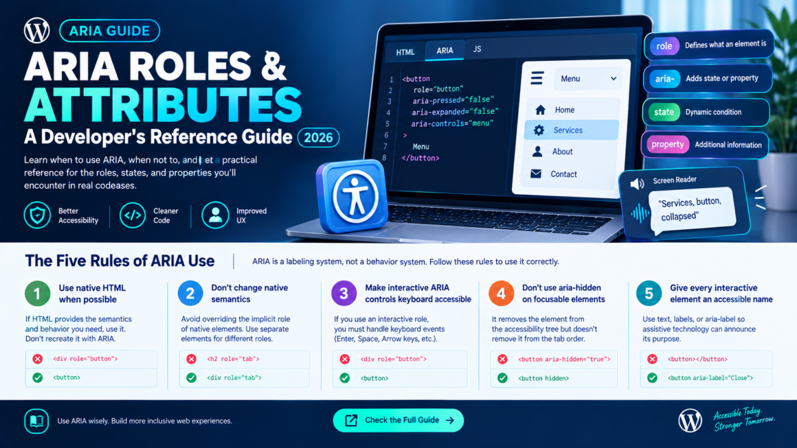
Here’s a stat that should bother you: pages that use ARIA average 59.1 detectable accessibility errors, compared to 42 on pages without ARIA, according to the 2026 WebAIM Million report. The technology designed to improve accessibility is correlated with worse accessibility. Not because ARIA is bad, but because developers reach for it before understanding it, and bad ARIA is worse than no ARIA at all.
This guide covers ARIA roles and attributes the way developers actually need them: what ARIA is, when to use it (rarely), when not to (usually), and a practical reference for the roles, states, and properties you’ll encounter in real codebases. Every other post in your accessibility checklist references ARIA; this is where you learn what those references mean.
What ARIA Actually Is
WAI-ARIA (Web Accessibility Initiative – Accessible Rich Internet Applications) is a W3C specification that lets you add semantic information to HTML elements when native HTML alone can’t describe what’s happening. It consists of three types of declarations:
- Roles: what an element is (a button, a tab, a navigation landmark).
- States: an element’s current condition that changes dynamically (expanded, checked, disabled).
- Properties: supplemental information about an element that’s relatively static (a label, a description, whether it controls another element).
ARIA changes what assistive technology announces about an element. It does not change how the element looks, behaves, or responds to keyboard input. This is the single most important thing to understand: ARIA is a labeling system, not a behavior system. Adding role="button" to a <div> tells a screen reader “this is a button,” but it doesn’t make it focusable, clickable by Enter/Space, or styled like a button. You’re responsible for all of that yourself.
The Five Rules of ARIA Use
The W3C publishes five rules that govern when and how to use ARIA. Internalize these before writing a single aria- attribute.
Rule 1: Don’t use ARIA if native HTML does the job
This is the first rule because it’s the most frequently violated. If a native HTML element provides the semantics and behavior you need — use the native element. Don’t <div role="button"> when you can <button>. Don’t <span role="link"> when you can <a href>. Don’t <div role="checkbox"> when you can <input type="checkbox">.
Native HTML elements come with keyboard behavior, focus management, form submission, and accessibility semantics for free. ARIA gives you only the semantics; everything else you must reimplement manually.
<!-- ❌ Unnecessary ARIA — all behavior must be manually reimplemented -->
<div role="button" tabindex="0" onclick="submit()"
     onkeydown="if(event.key==='Enter'||event.key===' '){submit();}">
  Submit
</div>

<!-- ✅ Native HTML — keyboard, focus, form submission, and semantics built in -->
<button onclick="submit()">Submit</button>
Rule 2: Don’t change native HTML semantics unless you must
Don’t override the implicit role of a native element. A <h2 role="tab"> is confusing; it’s a heading that announces as a tab. Use a separate element for the tab role.
<!-- ❌ Overriding heading semantics -->
<h2 role="tab">Settings</h2>

<!-- ✅ Separate elements for separate roles -->
<div role="tab">Settings</div>
<h2>Settings panel content</h2>
Rule 3: All interactive ARIA controls must be keyboard accessible
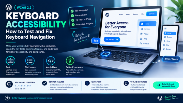
If you give an element an interactive role (button, tab, checkbox, slider), it must be operable by keyboard. ARIA declares “this is a button” but doesn’t add Enter or Space handling. You must do that yourself. See the keyboard accessibility guide for the expected keyboard patterns for each widget.
Rule 4: Don’t use aria-hidden="true" on focusable elements
aria-hidden="true" removes an element from the accessibility tree; screen readers can’t see it. But it doesn’t remove it from the tab order. A focusable element with aria-hidden="true" creates a ghost: keyboard users Tab to something that doesn’t exist to screen readers. They hear nothing, but focus is stuck on an invisible element.
<!-- ❌ Focusable but hidden from accessibility tree — ghost element -->
<button aria-hidden="true">Close</button>

<!-- ✅ If you need to hide it from everyone, use both -->
<button aria-hidden="true" tabindex="-1" style="display:none;">Close</button>

<!-- ✅ Or just hide it properly -->
<button hidden>Close</button>
Rule 5: All interactive elements must have an accessible name
Every button, link, input, and custom widget needs a name that assistive technology can announce. This can come from:
- Text content inside the element:
<button>Save</button>. - A
<label>element associated byfor/id. aria-label(a direct text string).aria-labelledby(references another visible element’s text).
If none of these exist, the element announces as “button” or “link” with no name, unusable.
ARIA Roles: The Complete Developer Reference
Roles fall into six categories. You’ll use landmark and widget roles most often; the others are situational.
Landmark roles
Landmarks define the major regions of a page. Screen reader users navigate by landmarks the way sighted users scan for headers and sidebars.
| Role | Native HTML equivalent | When to use ARIA version |
|---|---|---|
banner | <header> (page-level) | Only if you can’t use <header> |
navigation | <nav> | Only if you can’t use <nav> |
main | <main> | Only if you can’t use <main> |
complementary | <aside> | Only if you can’t use <aside> |
contentinfo | <footer> (page-level) | Only if you can’t use <footer> |
region | <section> (with accessible name) | When a named section doesn’t fit the above |
search | <search> (HTML 2023+) | If <search> element isn’t available |
form | <form> (with accessible name) | Only if you can’t use <form> |
Key rule: don’t double up. <nav role="navigation"> is redundant — <nav> already implies the navigation role. Adding both doesn’t break anything, but it’s unnecessary noise in the code.
Multiple landmarks of the same type need labels to distinguish them. Two <nav> elements should have aria-label="Main navigation" and aria-label="Footer navigation" so screen reader users know which is which.
Widget roles
These describe interactive components. Use them only when no native HTML element matches.
| Role | What it represents | Native HTML to prefer |
|---|---|---|
button | A clickable control | <button> |
link | A hyperlink | <a href> |
checkbox | A checkable box | <input type="checkbox"> |
radio | A radio button in a group | <input type="radio"> |
textbox | A text input | <input type="text"> or <textarea> |
slider | A value selector in a range | <input type="range"> |
switch | A binary toggle (on/off) | No native equivalent — ARIA is correct here |
tab | A tab in a tabbed interface | No native equivalent |
tabpanel | Content associated with a tab | No native equivalent |
tablist | A container for tabs | No native equivalent |
menu | A menu of actions | No direct equivalent for app menus |
menuitem | An item in a menu | No direct equivalent |
dialog | A modal or non-modal dialog | <dialog> (use native when possible) |
alertdialog | A dialog that needs immediate attention | No native equivalent |
tooltip | A popup description | No native equivalent |
tree | A hierarchical list | No native equivalent |
treeitem | An item in a tree | No native equivalent |
listbox | A list of selectable options | <select> |
option | An option in a listbox | <option> |
combobox | A text input with a popup list | No full native equivalent |
progressbar | A progress indicator | <progress> |
scrollbar | A scrollbar control | Native scrollbars |
spinbutton | A numeric stepper | <input type="number"> |
The roles with no native equivalent (switch, tab/tablist/tabpanel, menu/menuitem, tree, combobox, alertdialog) are where ARIA genuinely earns its keep. For everything else, prefer the native element.
Document structure roles
| Role | Purpose |
|---|---|
heading | Identifies a heading (use <h1>–<h6> instead) |
list / listitem | Identifies a list (use <ul>/<ol>/<li> instead) |
table / row / cell / columnheader / rowheader | Table structure (use <table>/<tr>/<td>/<th> instead) |
img | Identifies an image (use for inline SVGs; <img> has implicit role) |
article | Self-contained content (use <article>) |
figure | A figure with a caption (use <figure>) |
separator | A visual divider (use <hr>) |
toolbar | A group of controls |
group | A generic grouping of related elements |
presentation / none | Removes semantic meaning; element is decorative |
Live region roles
These tell screen readers how to handle dynamic content changes.
| Role | Behavior |
|---|---|
alert | Announces immediately (assertive). Use for error messages, urgent notifications. |
status | Announces at next pause (polite). Use for status updates, save confirmations. |
log | New entries announced; old entries preserved. Chat messages, activity feeds. |
timer | A running timer. Screen readers may not continuously announce. |
marquee | Changing content (like a ticker). Rarely appropriate. |
ARIA States and Properties: The Practical Set
You don’t need to memorize all 50+ ARIA attributes. These are the ones that show up in real development work.
Naming and describing
| Attribute | Purpose | Example |
|---|---|---|
aria-label | Provides an accessible name directly | <button aria-label="Close dialog">×</button> |
aria-labelledby | Points to a visible element whose text is the name | <div role="dialog" aria-labelledby="dialog-title"> |
aria-describedby | Points to a visible element that provides additional description | <input aria-describedby="password-hint"> |
Priority: when both exist, aria-labelledby overrides aria-label. Visible text content overrides both for most elements. The accessible name computation follows a defined algorithm but the short version is: visible text > aria-labelledby > aria-label > title attribute.
State management
| Attribute | Values | Use for |
|---|---|---|
aria-expanded | true / false | Accordions, dropdowns, collapsible sections is the content visible? |
aria-checked | true / false / mixed | Custom checkboxes and switches |
aria-selected | true / false | Tabs, listbox options, grid cells |
aria-pressed | true / false / mixed | Toggle buttons (bold button in an editor) |
aria-disabled | true / false | Disabled controls (prefer native disabled attribute when available) |
aria-hidden | true / false | Removes from accessibility tree (decorative icons, duplicated content) |
aria-invalid | true / false / grammar / spelling | Form fields with validation errors |
aria-busy | true / false | Loading states tells screen readers to wait |
aria-current | page / step / location / date / time / true | Current item in a set (current page in navigation) |
Relationship attributes
| Attribute | Purpose | Example |
|---|---|---|
aria-controls | This element controls another | Accordion trigger → accordion panel |
aria-owns | This element contains another (when DOM order doesn’t reflect visual relationship) | A combobox → its dropdown list |
aria-activedescendant | The currently active item inside a composite widget | A listbox → the currently highlighted option |
aria-flowto | Overrides reading order to a different element | Rarely used; careful with this |
aria-errormessage | Points to the element containing the error message for this input | An input → its error <p> |
Live region attributes
| Attribute | Values | Behavior |
|---|---|---|
aria-live | polite / assertive / off | How urgently to announce changes |
aria-atomic | true / false | Announce the entire region or just the change |
aria-relevant | additions / removals / text / all | What types of changes to announce |
<!-- Status message: announced politely after current speech finishes -->
<div aria-live="polite" aria-atomic="true">
  3 items added to cart.
</div>

<!-- Error alert: announced immediately, interrupting current speech -->
<div role="alert">
  Payment failed. Please check your card details.
</div>
role="alert" is equivalent to aria-live="assertive" you don’t need both.
The Patterns That Go Wrong
Adding ARIA to native elements
<!-- ❌ Redundant and potentially confusing -->
<button role="button" aria-pressed="false">Save</button>

<!-- ✅ Native button doesn't need role="button" -->
<button>Save</button>
Forgetting to update state
<!-- ❌ aria-expanded never changes — screen reader always hears "collapsed" -->
<button aria-expanded="false" onclick="toggleMenu()">Menu</button>

<!-- ✅ JavaScript updates the state -->
<button aria-expanded="false" onclick="toggleMenu(this)">Menu</button>
<script>
function toggleMenu(btn) {
  const expanded = btn.getAttribute('aria-expanded') === 'true';
  btn.setAttribute('aria-expanded', !expanded);
  document.getElementById('menu').hidden = expanded;
}
</script>
Using aria-label on non-interactive elements
aria-label is reliably supported only on interactive elements (buttons, links, inputs) and landmark/widget roles. Putting aria-label on a <div> or <span> with no role does nothing in most screen readers the attribute is silently ignored.
<!-- ❌ aria-label on a generic div — ignored by most screen readers -->
<div aria-label="Important notice">This is important.</div>

<!-- ✅ Add a role if you need the label -->
<div role="region" aria-label="Important notice">This is important.</div>

<!-- ✅ Or use a semantic element -->
<section aria-label="Important notice">This is important.</section>
Hiding content with aria-hidden that’s still focusable
Covered in Rule 4 above, but it’s worth repeating because it’s the source of the highest-severity ARIA bugs. If you aria-hidden a container, every focusable element inside it becomes a ghost. Either remove them from the tab order with tabindex="-1" or use display: none / hidden instead.
Testing Your ARIA
Automated scanners catch some ARIA issues missing required attributes, invalid role values, aria-hidden on focusable elements. They can’t catch semantic correctness (did you use the right role?) or state management (does aria-expanded actually update?).
Run a full scan for the automated checks, then test manually:
- Open the browser’s accessibility tree. Chrome DevTools → Elements → Accessibility pane shows how the browser interprets your ARIA. Every role, state, and name is visible here.
- Test with a screen reader. NVDA (free, Windows) or VoiceOver (built-in, macOS). Navigate by landmarks, headings, and form controls. Do widgets announce their role and state correctly? Does
aria-expandedread “collapsed” when closed and “expanded” when open? - Keyboard test. Every interactive ARIA widget must be fully keyboard operable. Tab to it, use the expected keys, make sure focus management works.
If you’re documenting ARIA conformance in a VPAT, the relevant criterion is SC 4.1.2 Name, Role, Value. The row where you report whether all interactive elements expose their identity and state to assistive technology.
ARIA Roles and Attributes FAQ
When should I use ARIA?
Only when native HTML doesn’t provide the semantics or behavior you need. Tabs, switches, tree views, comboboxes, and app-style menus have no native HTML equivalent; ARIA is correct there. For buttons, links, checkboxes, headings, and tables, use native HTML.
Does ARIA add keyboard functionality?
No. ARIA only changes what assistive technology announces. You must implement all keyboard behavior yourself with JavaScript.
Is it true that pages with ARIA have more errors?
Yes, the 2026 WebAIM Million found pages with ARIA averaged 59.1 errors vs. 42 without. This reflects misuse, not a flaw in ARIA itself. The cure is using ARIA correctly and sparingly, not avoiding it entirely.
What’s the difference between aria-label and aria-labelledby?
aria-label provides the name as a text string directly on the element. aria-labelledby points to another visible element whose text content becomes the name. aria-labelledby takes precedence and is preferred when the label text is already visible on the page.
Can I use aria-hidden to hide decorative icons?
Yes, that’s exactly what it’s for. <svg aria-hidden="true"> removes a decorative icon from the accessibility tree. Make sure the icon isn’t focusable (no tabindex, not inside a <button> that relies on it as the only label).
Do I need role="navigation" on a <nav> element?
No. <nav> already has the implicit navigation role. Adding it explicitly is redundant.
Get ARIA Right
The paradox of ARIA is that the less you use it, the better your accessibility usually is because it means you’re using native HTML correctly. Save ARIA for the patterns that genuinely need it (tabs, switches, trees, comboboxes, live regions, complex widgets), test with real screen readers, and keep every state attribute synchronized with the actual UI. Run your pages through a full scan to catch the automated ARIA issues, then verify with the WCAG 2.2 Checklist and a manual screen reader walkthrough.
This article is general guidance, not legal advice. ARIA support varies across assistive technologies and browsers test with real tools on real devices before making accessibility claims.