Keyboard Accessibility: How to Test and Fix Keyboard Navigation
 By Admin
10 min read
By Admin
10 min read 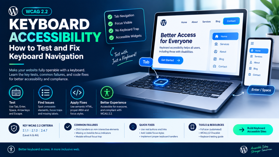
Unplug your mouse. Now try to use your website. If you can’t reach a button, open a dropdown, close a modal, or submit a form your keyboard users can’t either. That includes people who use screen readers, switch devices, voice control, or who simply can’t operate a mouse due to tremor, injury, or motor disability.
Keyboard accessibility is one of the four pillars of WCAG (Operable), and it’s the single most reliable manual test you can run. No tool purchase required, no technical setup just the Tab key and a few minutes per page. This guide covers how to test keyboard navigation, the specific failures that show up in every audit, and the code fixes for each one. Start with an automated full scan to catch the machine-detectable issues, then use this guide for the manual keyboard walkthrough.
Why Keyboard Access Is Non-Negotiable
Keyboard operability is a Level A requirement the absolute floor of WCAG conformance. Three success criteria govern it:
- SC 2.1.1 Keyboard (Level A): All functionality must be operable through a keyboard interface, with no specific timing required for individual keystrokes.
- SC 2.1.2 No Keyboard Trap (Level A): If keyboard focus can enter a component, it must be able to leave. Users must never get stuck.
- SC 2.4.7 Focus Visible (Level AA): Any keyboard-operable element must have a visible focus indicator.
These aren’t niche requirements. Every screen reader user navigates by keyboard. Every switch-device user depends on keyboard patterns. Voice-control software like Dragon NaturallySpeaking maps voice commands to keyboard actions. When keyboard access breaks, all of these break with it.
The Keyboard Testing Method
This is the test every developer should run before shipping. It takes 10 – 15 minutes per page and catches problems no automated tool can.
The keys you need
| Key | Action |
|---|---|
| Tab | Move focus to next interactive element |
| Shift + Tab | Move focus to previous element |
| Enter | Activate links and buttons |
| Space | Activate buttons, toggle checkboxes, open selects |
| Arrow keys | Navigate within grouped widgets (tabs, radio groups, menus, sliders) |
| Escape | Close popups, modals, dropdowns, tooltips |
The walkthrough
- Click the browser address bar and press Tab. The first interactive element on the page should receive focus.
- Check for a skip link. The first Tab stop should be a “Skip to main content” link (SC 2.4.1). Press Enter it should jump focus past the navigation to the main content area.
- Tab through every element on the page. Every link, button, input, select, and custom widget should receive focus in a logical order. Watch for:
- Elements you can’t reach at all (Tab skips them).
- Elements that receive focus but shouldn’t (decorative elements, hidden off-screen content).
- Focus order that doesn’t match visual order (Tab jumps from the header to the footer, skipping the main content).
- At every focused element, check the focus indicator. Can you see which element is focused? If focus disappears or is invisible, that’s a 2.4.7 failure.
- Operate every interactive widget:
- Links: Enter activates.
- Buttons: Enter or Space activates.
- Dropdowns: Space or Enter opens; Arrow keys navigate options; Enter selects; Escape closes.
- Modals: Tab cycles within the modal (focus trap); Escape closes; focus returns to the element that opened it.
- Tabs: Arrow keys switch tabs; Tab moves into the tab panel content.
- Accordions: Enter or Space toggles; focus stays on the trigger.
- Sliders: Arrow keys adjust value.
- Date pickers: arrow navigation within the calendar grid; Escape closes.
- Check for keyboard traps. At every point, press Tab and Shift+Tab to verify you can leave. Then press Escape. If you ever get stuck focus won’t move forward or backward that’s a 2.1.2 failure.
- Submit every form by keyboard only. Tab to each field, enter data, Tab to the submit button, press Enter. Check that error messages appear and focus moves to the first error.
The Failures That Show Up in Every Audit
1. Click handlers on non-interactive elements
The most common keyboard failure on the web. A <div> or <span> with an onclick handler but no keyboard support it works with a mouse click but Tab skips it entirely.
<!-- ❌ Inaccessible: div with click handler, no keyboard support -->
<div class="card" onclick="openDetail()">View details</div>

<!-- ✅ Accessible: use a real button -->
<button class="card" onclick="openDetail()">View details</button>

<!-- ✅ Or if you must use a div: add role, tabindex, and keyboard handler -->
<div class="card"
     role="button"
     tabindex="0"
     onclick="openDetail()"
     onkeydown="if(event.key==='Enter'||event.key===' '){event.preventDefault();openDetail();}">
  View details
</div>
The real fix is almost always: use a <button> or <a> instead of a <div>. Native HTML elements come with keyboard support, focus management, and role semantics for free. The <div> approach requires you to manually recreate all of that.
2. Focus indicators removed with no replacement
/* ❌ This removes focus visibility for keyboard users */
*:focus {
  outline: none;
}

/* ✅ Replace with a visible custom focus style */
*:focus-visible {
  outline: 3px solid var(--brand-blue);
  outline-offset: 2px;
}
Use :focus-visible instead of :focus it shows the outline for keyboard navigation but not for mouse clicks, giving you the clean aesthetic designers want without breaking accessibility. The outline needs at least 3:1 contrast against adjacent colors (SC 1.4.11).
3. Modals that don’t trap focus
A modal opens but Tab sends focus behind it into the page content, invisible under the overlay. The user tabs through elements they can’t see and has no way to close the modal.
// ✅ Focus trap for modals
function trapFocus(modal) {
  const focusable = modal.querySelectorAll(
    'a[href], button:not([disabled]), input:not([disabled]), select:not([disabled]), textarea:not([disabled]), [tabindex]:not([tabindex="-1"])'
  );
  const first = focusable[0];
  const last = focusable[focusable.length - 1];

  modal.addEventListener('keydown', (e) => {
    if (e.key === 'Escape') {
      closeModal();
      return;
    }
    if (e.key !== 'Tab') return;

    if (e.shiftKey) {
      if (document.activeElement === first) {
        e.preventDefault();
        last.focus();
      }
    } else {
      if (document.activeElement === last) {
        e.preventDefault();
        first.focus();
      }
    }
  });

  first.focus(); // Move focus into the modal on open
}

function closeModal() {
  modal.hidden = true;
  triggerButton.focus(); // Return focus to the element that opened it
}
Three requirements for an accessible modal: focus moves into it on open, Tab cycles within it (trapping), and Escape closes it and returns focus to the trigger.
4. Custom dropdowns without keyboard interaction
A “custom select” built from <div>s that opens on click but doesn’t respond to Arrow keys, Enter, or Escape. Screen readers can’t interact with it at all.
<!-- ✅ Use native <select> when possible — it's keyboard-accessible by default -->
<select name="country">
  <option>United States</option>
  <option>Canada</option>
  <option>United Kingdom</option>
</select>

<!-- If you must build custom: implement the listbox pattern -->
<div role="combobox" aria-expanded="false" aria-haspopup="listbox" tabindex="0">
  <span>Select country</span>
  <div role="listbox" hidden>
    <div role="option" id="us">United States</div>
    <div role="option" id="ca">Canada</div>
    <div role="option" id="uk">United Kingdom</div>
  </div>
</div>
Custom dropdowns need the full ARIA listbox or combobox pattern: Arrow keys navigate options, Enter selects, Escape closes, and aria-activedescendant or focus management tracks the current option. This is a lot of work to get right use native <select> unless you have a compelling reason not to.
5. Infinite scroll with no keyboard alternative
Content loads as you scroll, but keyboard users can’t trigger the load they Tab past the visible content and land on the footer, with no way to access the remaining items.
Fix: Provide a “Load more” button that’s keyboard-focusable and appears after the last loaded item. After loading, move focus to the first new item so the user can continue from where they were.
6. Off-screen elements receiving focus
Hidden navigation menus, collapsed accordions, or off-canvas panels that are positioned off-screen with CSS but still in the Tab order. The user presses Tab and focus disappears it’s on an element they can’t see.
/* ❌ Off-screen but still focusable */
.mobile-nav {
  position: absolute;
  left: -9999px;
}

/* ✅ Actually hidden — removed from tab order */
.mobile-nav {
  display: none;
}
/* Or */
.mobile-nav[hidden] {
  display: none;
}
/* Or */
.mobile-nav {
  visibility: hidden;
}
display: none and visibility: hidden remove elements from the tab order. position: absolute; left: -9999px does not — the element is invisible but still focusable. Use display: none for hidden panels and toggle it when they become visible.
7. No skip navigation link
Without a skip link, keyboard users must Tab through the entire site header, navigation, and sidebar on every page load before reaching the content.
<!-- First element in <body> -->
<a href="#main-content" class="skip-link">Skip to main content</a>

<!-- The target -->
<main id="main-content">
  ...
</main>
.skip-link {
  position: absolute;
  top: -100%;
  left: 0;
  z-index: 1000;
  padding: 12px 24px;
  background: var(--brand-blue);
  color: white;
  font-size: 1rem;
}
.skip-link:focus {
  top: 0;
}
The skip link is visually hidden until it receives focus the first Tab stop reveals it, Enter activates it, and focus jumps to #main-content.
Keyboard Patterns for Common Widgets (ARIA Authoring Practices)
The W3C publishes the ARIA Authoring Practices Guide (APG) with the expected keyboard interactions for every common widget. The key patterns:
| Widget | Expected keyboard behavior |
|---|---|
| Tabs | Arrow keys switch tabs; Tab moves into panel content |
| Accordion | Enter/Space toggles section; Arrow keys move between headers |
| Menu | Arrow keys navigate items; Enter activates; Escape closes |
| Dialog (modal) | Tab cycles within; Escape closes; focus returns to trigger |
| Slider | Arrow keys adjust value; Home/End jump to min/max |
| Tree view | Arrow keys navigate; Enter expands/collapses; right arrow expands, left arrow collapses |
| Combobox / autocomplete | Arrow keys navigate suggestions; Enter selects; Escape closes list |
If you’re building any custom widget, check the APG pattern first — it defines the keyboard contract your users expect.
How Keyboard Accessibility Connects to Everything Else
Keyboard access isn’t isolated it intersects with almost every other accessibility requirement:
- Focus indicators need 3:1 contrast against adjacent colors (SC 1.4.11) and must be visible (SC 2.4.7).
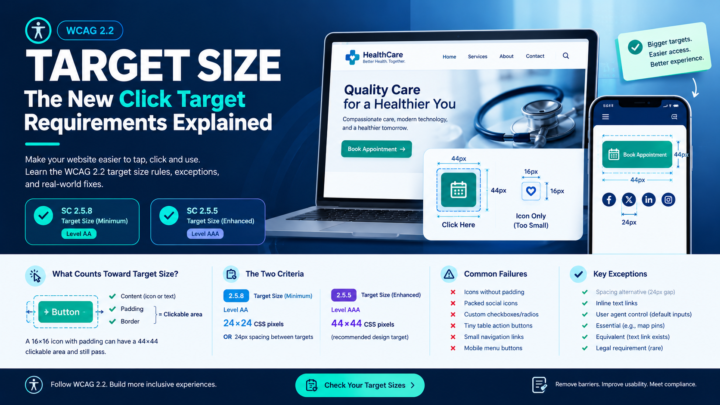
- Target size (SC 2.5.8) ensures keyboard-focused elements are large enough to also be tappable for touch users.
- Heading structure lets screen reader users navigate by headings, complementing Tab-based navigation with structural navigation.
- Form labels ensure keyboard users hear what each field is for when they Tab into it.
- VPAT recording: SC 2.1.1, 2.1.2, and 2.4.7 are rows in every VPAT and “Supports” on keyboard with no real testing is the claim that auditors challenge first.
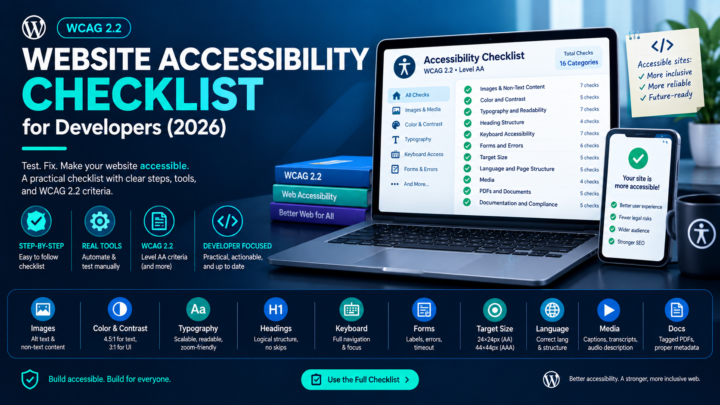
For the full testing workflow, see the Website Accessibility Checklist for Developers.
Keyboard Accessibility FAQ
Can automated tools test keyboard accessibility?
Partially. They can detect missing tabindex, focusable-but-hidden elements, and some ARIA issues. They cannot test whether Tab order is logical, whether custom widgets respond to the correct keys, or whether focus management in modals works correctly. Manual keyboard testing is essential.
Do I need to support every keyboard shortcut?
No. WCAG requires that all functionality is operable by keyboard Tab, Enter, Space, Arrow keys, Escape. You don’t need to implement custom keyboard shortcuts (Ctrl+S to save, etc.) unless your application specifically offers them.
What about mobile keyboard users?
External keyboards on tablets and phones use the same Tab/Enter/Arrow patterns. Mobile screen readers (VoiceOver, TalkBack) use swipe gestures instead of Tab but the underlying focus order and ARIA semantics are the same. If your keyboard implementation is correct, mobile assistive technology generally inherits the benefit.
Is tabindex="0" safe to use?
Yes, it adds an element to the natural Tab order at its position in the DOM. tabindex="-1" removes it from Tab order but allows programmatic focus (useful for focus management). Avoid positive tabindex values (tabindex="1", tabindex="5") they create a custom tab order that overrides the DOM and almost always causes more problems than it solves.
How do I handle single-page applications (SPAs)?
SPAs need explicit focus management on route changes. When the “page” changes without a full reload, move focus to the new content’s heading or main area otherwise keyboard users are left at the top of the DOM with no indication that content changed. Announce route changes with an ARIA live region or focus the new page heading.
Test Your Keyboard Access
Unplug the mouse. Tab through the page. That’s the test. If anything is unreachable, inoperable, or traps your focus, it’s a failure. Pair the manual walkthrough with an automated full scan to catch the code-level issues missing roles, hidden focusable elements, and ARIA errors and use the WCAG 2.2 Checklist to verify against every criterion. Free, no account.
This article is general guidance, not legal advice. Keyboard accessibility is one layer of a broader accessibility practice pair it with screen reader testing, visual checks, and content review for full WCAG conformance.